Recent Projects:
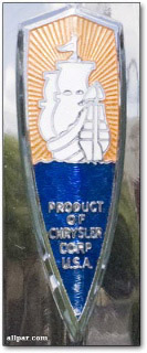
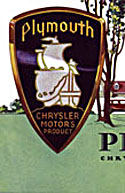
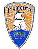
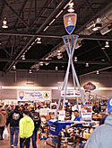
A Great Big Plymouth Logo The thumbnails below document my strategy; the pic at the right is proof that it worked. I found a better-proportioned logo in the 1932 Plymouth sales brochure, and made a high-res scan. I isolated the elements of the logo on separate layers in Photoshop, swapped in the color and detail from the provided snapshot, and applied a chrome treatment everywhere I could.
|
||||||
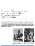
A fundraising brochure A group of citizens in Hubbard, Oregon, are creating a veterans memorial on a parkway in Hubbard, and naming it for Marion E. Carl, a Hubbard boy who was flying ace in World War II, and subsequently a famous test pilot, who retired with the rank of Major General. The fundraising committee approached one of my clients for help. My client's response was multi-faceted: he paid for the creation of this brochure, and hand-carried it to veterans' organizations throughout the Northwest with a plea for support. Budget was not a problem for this project, but the design and editorial sides presented challenges. Images came from a variety of sources, and quality was not consistent, and a designer may be hard-put to do justice to black-and-white images in a color publication. One aspect of design also impacted the writing: the client insisted on a large a readable typeface, which made brevity a necessity. Editorially, old veterans are a demanding audience: they want to see lots of detail, and it had better be correct! (I once reshot a Jeep-and-trailer photo spread because the knots in a tarp tie-down were not regulation!) Information about Marion Carl was abundant, and I was eventually able to create a biography that fit in the available space. |
||||||
Working for a car collector, Overview Working for a car collector, #1 – The catalog My client and I talked about creating a small publication, inexpensive enough to give away to visitors, that would serve as a self-guided tour of the collection, explaining the significance of each vehicle and discussing some of the artwork that was going up on the walls. The thumbnail at right links to a sample spread, full size, of the publication we began. I researched each vehicle; I took the pictures, wrote the copy, and laid everything out in InDesign. The only problem was the client: he kept adding items until the book was too bulky for a 5.5"x8.5" layout, and [we thought] too expensive to give away. We put it on hold. Working for a car collector, #2 – Signage Working for a car collector, #3 – Designing displays and murals
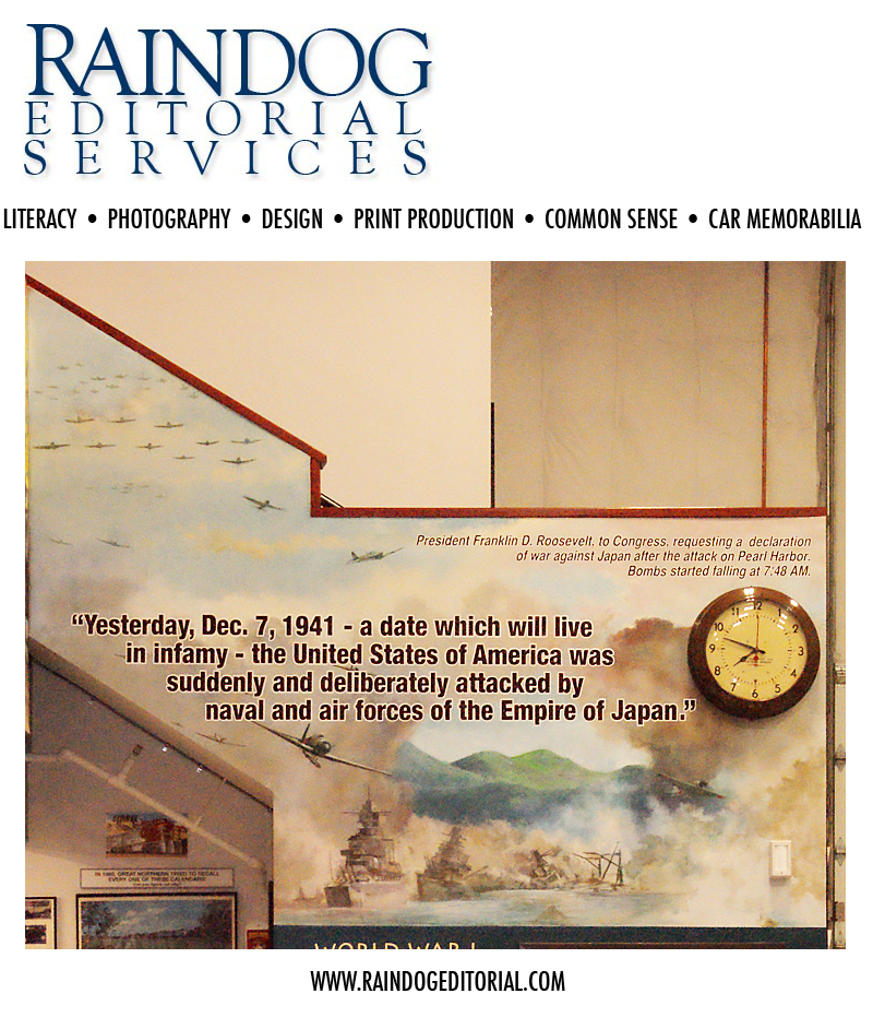
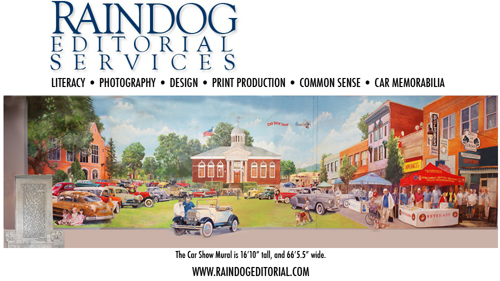
Working for a car collector, #4 – Captions for the murals The ability to work to scale in Photoshop made everything flow. I found a font size the client could read from the floor 20 feet away, and then wrote and rewrote copy directly in the Photoshop file to fit the space available, until I had prose we could live with. I tiled an actual-size document out of InDesign to my wide format printer, and we taped it together and put in on the wall. It fit in the space, and my client could read it! After we settled on the wording, John Higgins used my files from Photoshop to create the laser-cut vinyl characters. Click on the thumbnail to see the two captioned murals, and keep in mind that they are more than 8 feet off of the floor, and they extend almost 22 feet in width. Working for a car collector, #5 – The Car Show Mural We tried on different approaches for the better part of a year. We talked about a small-town parade, but that was unwieldy. We played with the idea of a collage, but couldn't figure out how to make it work. The notion of a car show and fair on a village green had the most staying power, but early efforts in that direction weren't encouraging, either. In the end, I made a village green in Photoshop, almost from scratch. A couple of quadrangles on the Pacific University campus gave me perspectives and sightlines that I could enlarge upon. Main Street in Forest Grove, Oregon, is a photogenic outpost of buildings from the turn of the last century, and I used both sides of the street. A couple of other historic buildings found their way into the mix. I patched things together in Photoshop until I had a village green that suited our purposes. Then we started parking cars on it. Our client went through his personal photos, picking out the people and cars that absolutely had to go in. Each one was scanned at high resolution, cut out, and placed in its own layer in the Photoshop file. Larry helped me move them around and resize them, teaching me a great deal about perspective and proportion as we went along. At various times, the Photoshop document contained at least 55 layers. Getting the image on the wall was a multi-step process. We printed bits of the Photoshop document to transparencies and projected them on the wall, so that Larry could get started with the backgrounds. Then I photographed the painted backgrounds, and moved them back into the Photoshop document, so that we could position the other elements precisely and print more transparencies. Of course, there are touches in the mural that were never in my Photoshop version – Larry Kangas worked considerable magic on his own before he put down his brushes. There are more pictures of this mural on Larry Kangas' website. Larry has some perspective shots that show the mural in context, and provide a better idea of how big it really is. Check them out! Working for a car collector, #6 – Back to the book Some people breeze past the cars, glance at the murals, and then go on their way. For them, the signage and explanatory material is superfluous. Other people try to read every word in every sign, and find the experience overwhelming. There is too much in this space to absorb easily in one visit. And some of the visitors come from quite a distance, so coming back until they're satisfied is not an option. We're back to the idea of a book. It won't be a small book, this time. Printing technology has changed in the past two years, and the cost of a fairly nice, short-run publication has declined dramatically. In any case, the cost isn't necessarily as important as getting the point across. A small-format coffeetable book would be a nice keepsake gift to offer to visitors, and it would be something they could return to again and again, until they understood the experiences and impulses that led to the creation of this remarkable place. That's what we're discussing in the winter of 2011. |
||||||
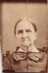
Other projects: A very low-budget brochure Since Better People couldn't afford printing in the first place, we dispensed with it entirely. I created a trifold brochure and furnished it in Portable Document Format (PDF). It is distributed by email to the counselors, caseworkers, etc., who will be using it, and they print the brochure from their desktop- or office printers as clients need them. I duplicated the typeface and general look of the organization's website, but created the document in black-and-white so it could print effectively anywhere. I keep the original document on file (in Adobe InDesign®) and provide updates as required. The image at right links to a screen-optimized PDF of the brochure. |
||||||
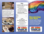
A logo, a brochure, a website My first project for GLAPN was their logo (right), Rockwell Extra Bold
The third project was a website, built with Dreamweaver®. You can see it at http://www.glapn.org. |
||||||
New Leaf Environmental Concepts  Another designer had done a great artistic job with the company's logo, but it was raster art, created for a business card. Re-creating the leaf outline using bezier curves, and replacing the original typefaces with postscript fonts, gave us the flexibility we needed to resize the logo for stationery, the company website, and, untimately, a trade-show banner. Another designer had done a great artistic job with the company's logo, but it was raster art, created for a business card. Re-creating the leaf outline using bezier curves, and replacing the original typefaces with postscript fonts, gave us the flexibility we needed to resize the logo for stationery, the company website, and, untimately, a trade-show banner.
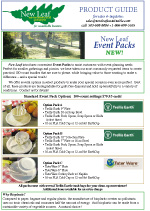
The solution was to create a unified format for product display. The pages are identical in concept and modular in construction, so illustrations and descriptions can be swapped in and out easily. They are created in InDesign® and saved as PDFs, optimized for a desktop printing. Most of the photos come from manufacturers' websites; however, in this case all of the photography is mine. Click the thumbnail to see a screen-resolution PDF. |
||||||
New Leaf's trade show banner
|
||||||

WEBSITES |